So, you are done with the video and all set for the marketing campaign? But wait, does it live up to the mobile logic?
By next year, 64% of people having mobiles will access content through their devices only and mobile videos will scale up to 13-fold in next four years.
In this mobile era, the majority of your audience is on-the-go and to make your video go viral, you have to make sure that your video satisfies the mobile logic that is you have to predominantly focus mobile viewers.

Image source
Mobile users are growing significantly in numbers and the best affirmative part is that they have the accessibility to watch your videos anytime and anywhere. All major hosting sites, such as YouTube, Wistia or Vidyard, auto-adjust for phone viewing, but did you know that you cannot have annotations and final CTAs in videos on a mobile device as they are not clickable? So, what’s the point of creating videos when they are not bringing you conversions?
Here are few tips on how you can optimize your video for mobile phones.
Why you should not rely totally on YouTube for video marketing?
The ultimate aim of creating video is to get conversions. You might have heard it again and again, that YouTube and Vimeo have already been designed in such a way that they fit for mobile when it comes to video player size. But if you are serious about video marketing, you should know that YouTube is indeed very small part of your video marketing campaign.
- YouTube doesn’t provide suitable annotations and makes it difficult for users to read video description where you normally link to your website, blog or any other landing page. It also adds a bit of disavowal when reading comments on mobile phones.
- Splash screen size or thumbnail chosen for YouTube will look great on the desktop, but when it scales down to a smaller size for mobile or tablet, it looks hideous.
So all inclusive, it is not a good idea to rely totally on YouTube for your video marketing strategy. We will suggest you to embed and promote videos from your site where you at least have the charge of the design and mobile experience.
Responsive player for your video
Make sure that your video looks great no matter if the viewer is using an iPhone (640px wide) or a large monitor (1920px wide). It should fit the size of the screen perfectly or else it will look awful on mobile phones. All major hosting sites such as YouTube and Vimeo have the option of auto-adjust for phone viewers but you would still want to go for a trial. Check how your video looks at the mobile phone before you hit promotion.
Enticing Thumbnail

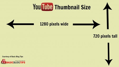
Thumbnails are one of the prominent features in tempting users, it needs to be catchy and aware viewers about the content at the same time. But they become unreadable at a smaller size and this can irk your audience. You can use bold thumbnails, so that they remain visible at all devices and can be compelling also. You can use Bootstrap and Player API to place an image over your player, the visitor will see this image when they visit from mobile. Place a play button on the image which will lead to video. Do some trials before promotion and make sure thumbnail looks great on every screen.
Faster loading time

Mobile viewers are impatient and they do not have time to waste on loading time. They are looking for a faster mode to get informative and shareable content. Check the quality setting and try to reduce audio, animations and the size of the images without losing the quality. You can also take help of hosting video site analytics to keep a check on how your video is performing.
Call to Action

People love your video, what next? Make sure you have a clickable CTA at the end of your video. Use a video platform that allows you to have a clickable final CTA on mobile for your own page. The best way would be to create a CTA that’s external to the video but still on the landing page. Also, focus on the visibility of the CTA button so that viewers doesn’t get lost on what to do next after watching the video.
You have to make sure you provide your audience with great user experience no matter how they choose to view your video. We hope these tips help you in creating great videos for mobile viewers.
If you also have other tips, please let us know in comments and we will add them with proper credits.
If you are looking to create digital video content, then get in touch with us now at Stagephod. Submit your video requirements here.


Hi,
Very informative post with easy step by step Guide to experience the best Mobile Videos….!!